

Launcher styles
Pick the style that fits your site layout and design. You set this in General settings at aibco.ai/dashboard/general.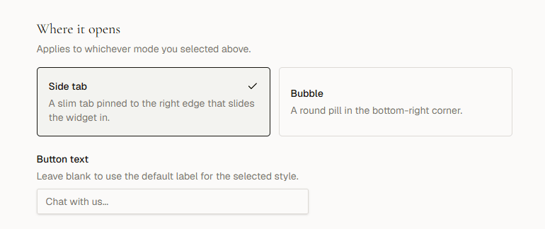
Side tab
A slim vertical label that sits on the right edge of the page. It stays visible as visitors scroll and works well when you want a persistent but unobtrusive entry point.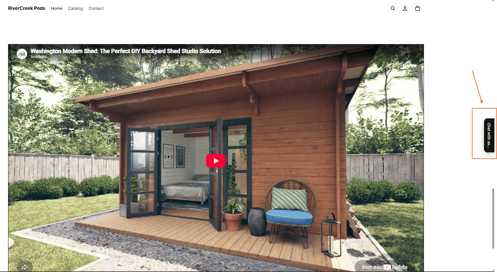
Bubble
A round floating pill anchored to the bottom-right corner of the screen. It draws more attention and feels familiar to visitors who expect chat-style widgets.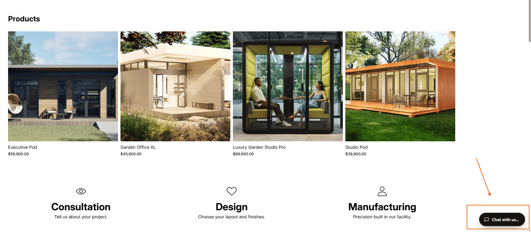
Launcher text
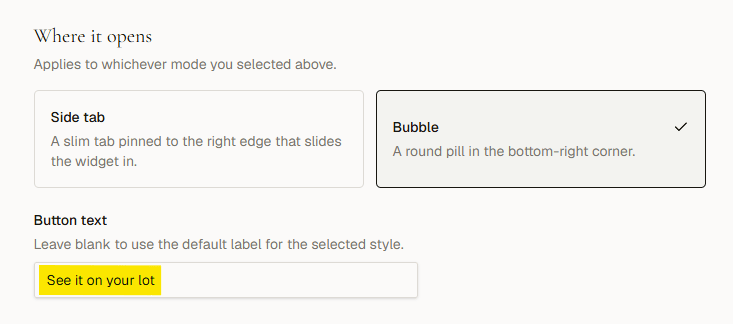
You can replace the default label with custom text that matches your brand or speaks directly to your visitor’s goal. To set custom launcher text:- Go to aibco.ai/dashboard/general.
- Find the Button text field.
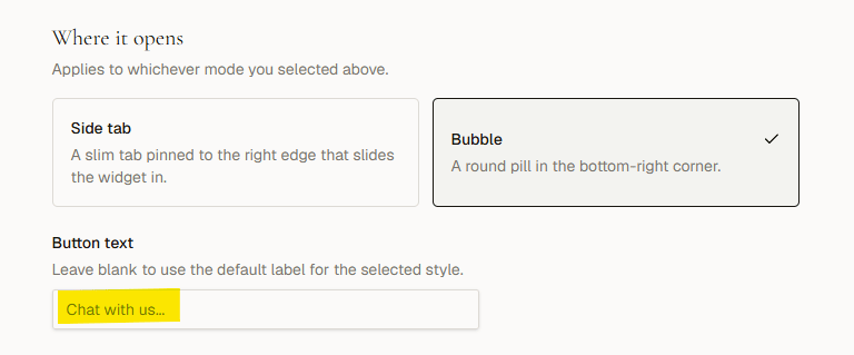
- Click the Button text field, enter your desired text (e.g., “See it on your lot”), then click outside the field to auto-save.
- Verify Changes. Reload your website to view the updated button text
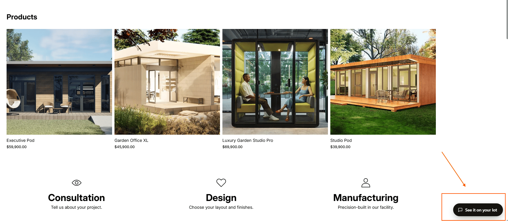
The launcher text works with both the Side tab and Bubble styles. It appears inside the launcher itself, so keep it short (one to five words is ideal).